Verve Painter is something I feel I've been looking for quite a while, its like a perfect blend of digital painting and oil painting without having to dig too much into settings and menus to find what you want. Verve is simple and easy to navigate, not to mention free too.
I feel I could explain what verve is but it would be easier to let you watch a video about the man who created it called Taron.
Hopefully that video has caught your attention to what is so unique about Verve painter. The fact that it has liquid mechanics and uses Open GL to power the software is something I haven't seen in any other painter. Sure there is Art rage and that's good at oil painting but I found it to be very cluttered and I had to dig a lot to change settings.
If you want to download the software you can for free at Taron's forum, here.
I also recommend reading through the manual too for useful hotkeys, here.
So whats my thoughts on Verve painter?
I first got hold of it thinking it be just like any other painting program but boy was I wrong. I found I had to step back and treat it more like oil paint and understand how colours mix together again. What I mean by that is that a feature called 'Smudge Chroma' reads what the basic colour of the paint you are using, so if you use a dark yellow and blend a light blue with it for example shades of green will start to show.
At first I found this annoying but that's because I wasn't using the painter properly. I can see when this would come in usefulness though with things like water.
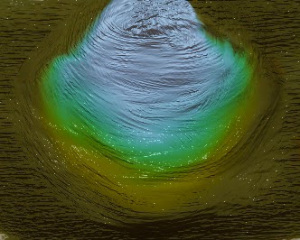
I figured for starting off I shouldn't really dive into painting portraits with this program til I have a better understanding of it. Landscapes seem to be a safe start to get the basics down and play around a little. First off I went with a speed painting to see what kind of effects I could do with it. I really like that the brush strokes can really give a sense of movement and what I notice while painting this was I was having fun and enjoying it! Something that photoshop seems to suck out for me when painting due to fiddling with settings. I think that because its stripped down it put me in a zone where I could be more creative. Kind of like when you give a person a digital SLR camera, it can do so many things its almost daunting and you spend too much time going through settings than letting your creative juices flow. So with that in mind I decided to embrace Verve for what it is and start with that mind set.
I had so much fun doing this and not worrying too much but just going with it and seeing what becomes of it.
Admittedly parts of this painting do look off like the foreground and the trees on the right. I did how ever enjoy how I could create motion in the water due to the bump and gloss that verve painter use. You can adjust these to be flat if you want like normal painter software but I just wanted to go with it for this.
I also recorded stages so you could see my process of working background to foreground rather than painting it in shapes first to get the composition right. It some what seems like a flawed idea and goes against how I learnt but I was some what inspired by how Bob Ross paints with oils.
So with what I learnt from the past two paintings I decided to go at it again and some what go in between and find my own comfort zone on how to use the painter. I'm really happy with how this turned out.
Overall Thoughts
Verve painter is really fun to use and is really growing on me and is quite a unique experience. I like that its free and Taron is updating it often with new features. Its well worth trying especially if you are new to using painting software. The fact that its less cluttered and limits you with a brush set forces you to be more creative rather than digging through certain menu's to get what you want.
I really want to see this painter do well and seems like a step up to what future painter software might be like.
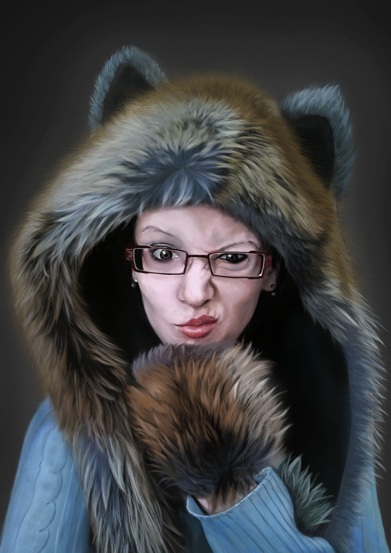
Fur is a tricky thing to paint, there is few of types of fur in my opinion; Which consist of the fuzzy kind which is a lot more finer hairs which you see in toys, there is the like groomed dog when which is like bristle and then there is the clumpy like fur with you see on wolfs like around there neck and chest.
In this tutorial I will be only going in to how I paint the clumpy kind, as my last painting required a lot of it.
First off I use a hair like brush which is modified to have some random strands. I'm not entirely sure how to save off just one brush on photoshop rather than a collection, when I figure that out I'll probably post up a link to download.
This is what the brush roughly looks like. I have it set to pen pressure on for the opacity and size. This is so when I push harder I can get a larger brush size then get lighter when doing the tip of the clump of fur. You don't really want bold colours when doing the tips as most the time the fur sprays out and is slightly fuzzy. The picture to the right is the kind of strokes the brush gives.
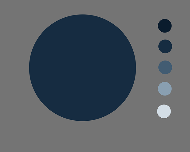
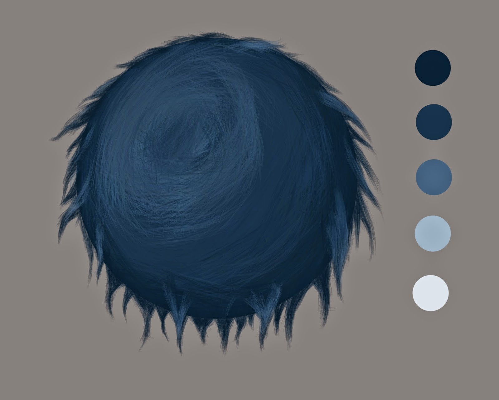
For painting the fur ball I simply ran with 5 shades of blue, you will probably end up using a lot more colours when painting fur yourself but, I figured I'd keep things simple.
First off, I find it important to start from the outside in because fur is just layers of hair, its just easier than having to paint back over already placed strands. I've painted in roughly where the light is hitting the ball so I can use it s just as a guide.
I try to use the top 3 tones of blue for this bit to get the shading of the ball right.
So now I've tried to cleaned the fur clumps on so you can see them more clearly and used darker tones near the paint of the clum where most of the light doesn't hit. Also I've started using a smaller sized brush to start adding the high lights using the pale blue then the lighter blue for small areas while trying not to over do it.
Finally I use a larger brush again and set the opacity to 50 percent and paint over the area again on the fur where the light is hitting to make it pop back out and and look like thicker clumps.
I hope this tutorial some what helps if you are struggling on how to start off painting fur. It may not be the perfect way to paint fur but I've seen some really confusing tutorials and I figured it be worth doing one on how I tackled fur.
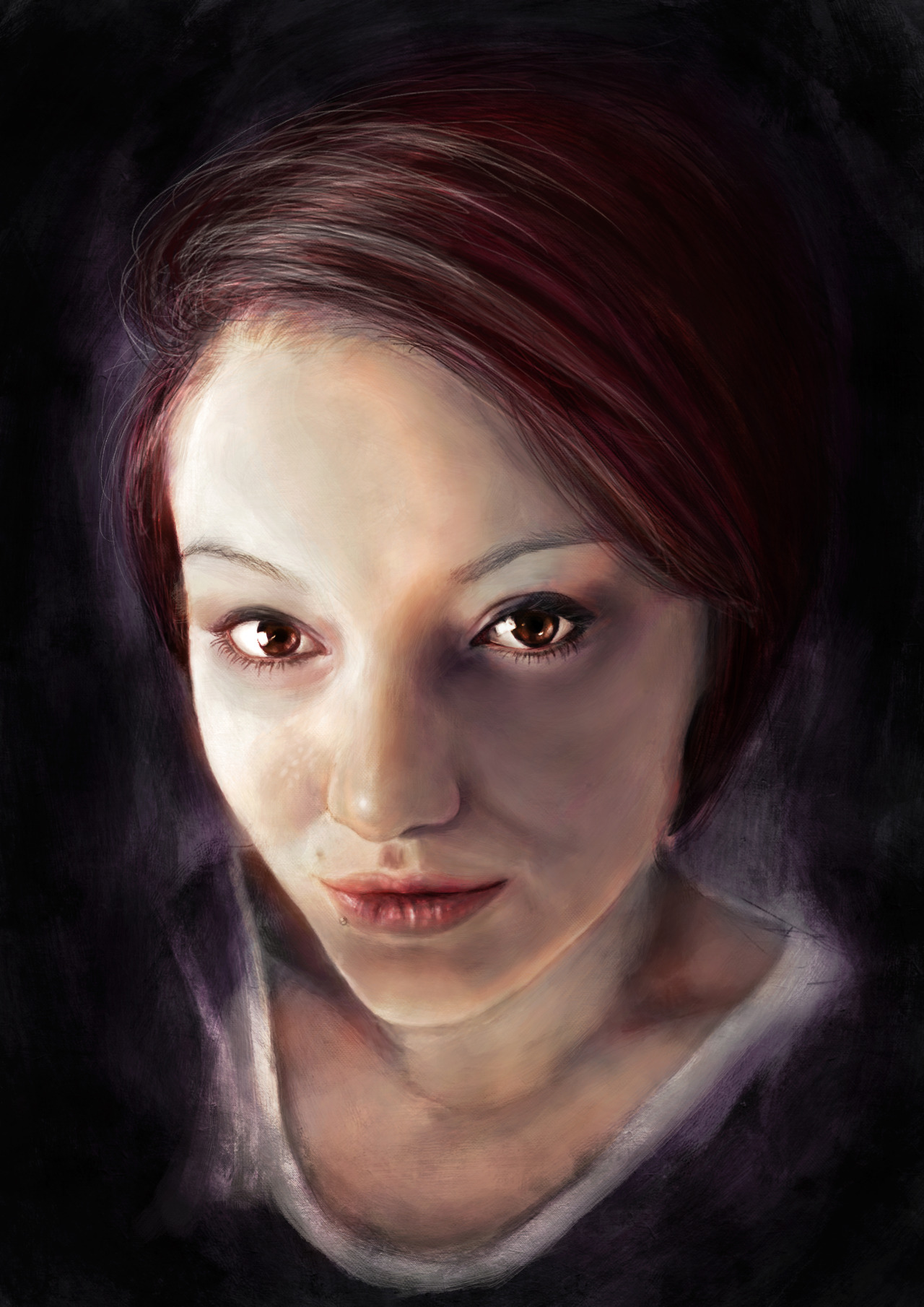
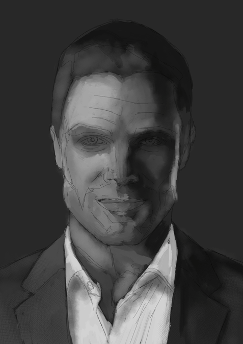
I've always struggled with doing hair and straight in colour and I felt it was time to finally push myself to improve. I used a black and white adjustment layer to keep checking the tones were right. For the fur I had to make a brush to do the fur. It took me a long while to figure it out. I'll probably go through my technique to painting fur at somepoint too.
This one I had to again start in black and white. I really struggle on tonal values in colour. I had had painted this once and posted on Facebook and it seemed to be missing something and that was Subsurface scattering. This is where the light and shadow meet and the light is absorbed in to the skin and kind makes this red/orange glow that you see commonly in ears and hands when put infront of a bright light.
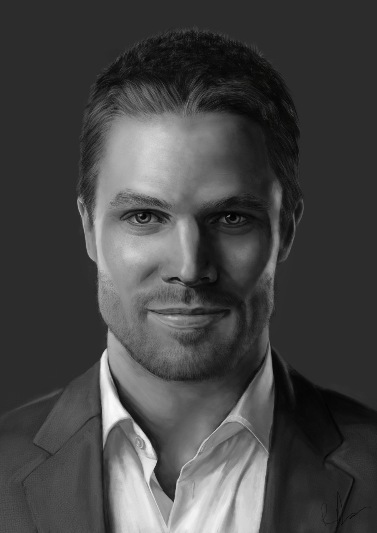
Normally I just use Photoshop and a Wacom Intous 5 but I've always liked using brushes that emulate brush strokes and Artrage seemed perfect for that. I had to paint in black and white first because I'm not too confident about painting straight in to colour. I started this in artrage but I ran in to issues with it purely just taking too long to go through changing the settings all the time. I ended up bringing it back in to photoshop to add colours and touch up areas. I really like the brush stroke effects it gave but it grew very tiresome that way of painting.
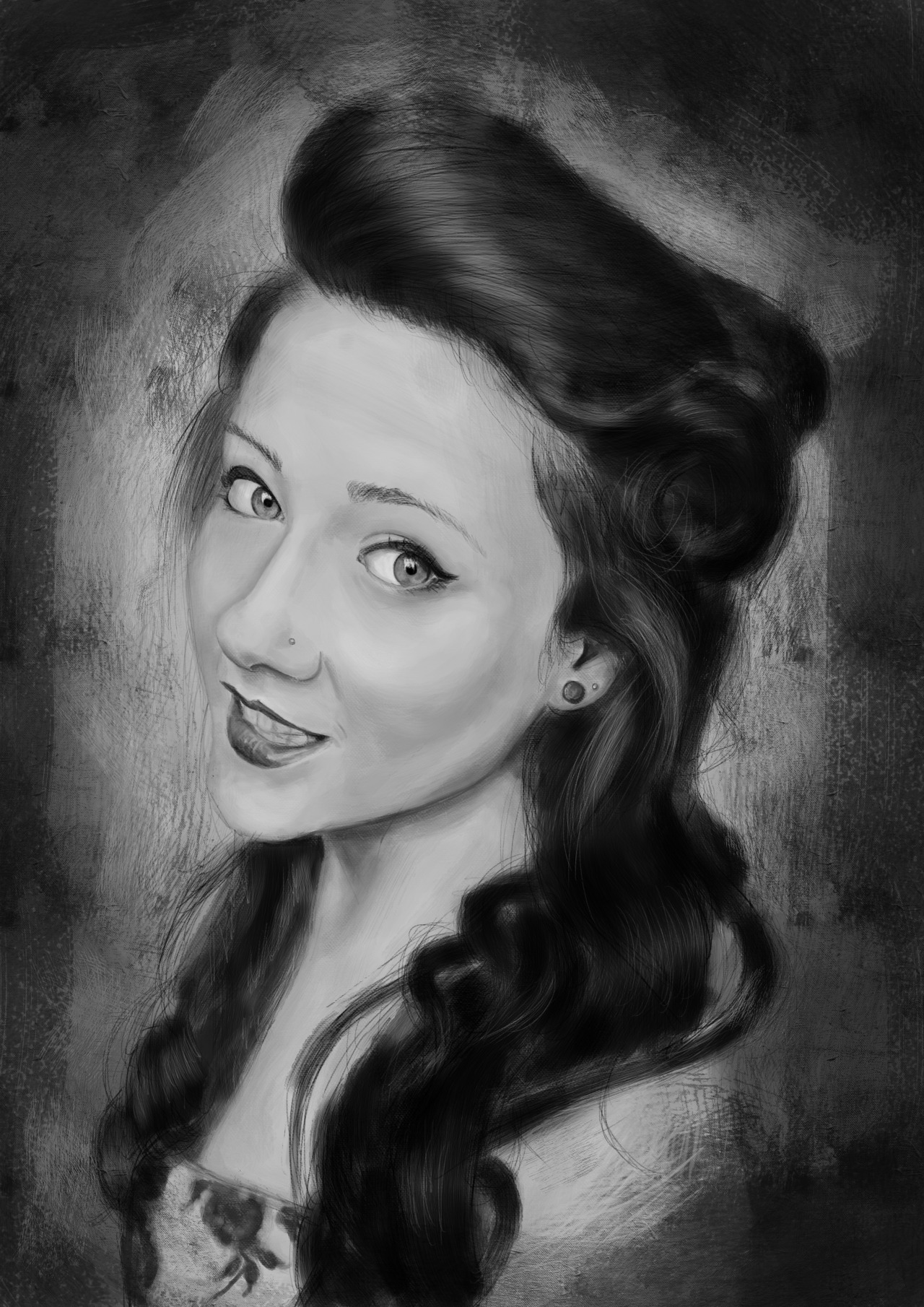
This one I've tried to focus on giving the eyes the most detail then have the viewers eye spiral around along the hair then on to the top she has on. I think it works well. I also made a Gif of the process of painting it so you can see where the most detail went.


 I first got hold of it thinking it be just like any other painting program but boy was I wrong. I found I had to step back and treat it more like oil paint and understand how colours mix together again. What I mean by that is that a feature called 'Smudge Chroma' reads what the basic colour of the paint you are using, so if you use a dark yellow and blend a light blue with it for example shades of green will start to show.
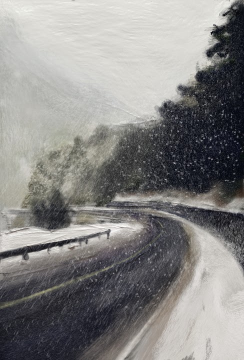 I figured for starting off I shouldn't really dive into painting portraits with this program til I have a better understanding of it. Landscapes seem to be a safe start to get the basics down and play around a little. First off I went with a speed painting to see what kind of effects I could do with it. I really like that the brush strokes can really give a sense of movement and what I notice while painting this was I was having fun and enjoying it! Something that photoshop seems to suck out for me when painting due to fiddling with settings. I think that because its stripped down it put me in a zone where I could be more creative. Kind of like when you give a person a digital SLR camera, it can do so many things its almost daunting and you spend too much time going through settings than letting your creative juices flow. So with that in mind I decided to embrace Verve for what it is and start with that mind set.


 First off, I find it important to start from the outside in because fur is just layers of hair, its just easier than having to paint back over already placed strands. I've painted in roughly where the light is hitting the ball so I can use it s just as a guide.